Style Guide

Home
Style Guide

Evocave Design System for Elementor Template Kit

A set of assets and guidelines for building a consistent and good user experience across elementor template kits by evocave

Version:
light-eds-v1.2.0

Grid System

The grid system ensures consistent alignment and structure across the design. It defines a framework of rows and columns to guide the placement of elements. By maintaining proportionality, it enhances the overall visual harmony of the layout. This system is crucial for creating responsive designs that adapt seamlessly to various screen sizes.

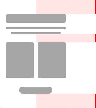
Device Width
≥ 1024px
< 1024px
< 767px
< 479px
Max Width
1280px
100%
100%
100%

Spacing System

The spacing system standardizes the gaps and margins between design components. It helps create balance and breathing space, making the layout visually appealing. Consistent spacing improves usability by clearly distinguishing different sections or elements. This system fosters a clean and organized look across all design assets.
Spacing - Desktop
64px
56px
64px
Spacing - Tablet
40px
32px
40px
Spacing - Mobile
32px
24px
32px

Color System

The color system provides a palette of primary, secondary, and neutral shades for a cohesive design. It defines the use of colors for branding, backgrounds, text, and interactive elements. By maintaining contrast and accessibility, it enhances readability and user experience. A well-defined color system establishes a strong visual identity for the design.
Primary
lightest
light
main
dark
darkest
Secondary
lightest
light
main
dark
darkest
Foreground
primary
secondary
placeholder
disabled
inverse
Background
primary
secondary
placeholder
disabled
inverse
Border
primary
secondary
placeholder
disabled

Typography

The typography system establishes the hierarchy and style of text elements in the design. It specifies font families, sizes, weights, and line heights to maintain consistency. Proper typography enhances readability, making the content easy to understand and engaging. This system plays a vital role in defining the tone and personality of the design.

Headline
Display
The five boxing wizards jump quickly.​
Heading 1

The five boxing wizards jump quickly.​

Heading 2

The five boxing wizards jump quickly.​

Heading 3

The five boxing wizards jump quickly.​

Heading 4

The five boxing wizards jump quickly.​

Heading 5
The five boxing wizards jump quickly.​
Heading 6
The five boxing wizards jump quickly.​
Text
Title
The five boxing wizards jump quickly.​
Subtitle
The five boxing wizards jump quickly.​
Button
The five boxing wizards jump quickly.​
Label
The five boxing wizards jump quickly.​
Quote
A design system is a collection of standards, guidelines, and reusable components that help teams create consistent visual design and user experiences across digital products
Review
A design system is a collection of standards, guidelines, and reusable components that help teams create consistent visual design and user experiences across digital products
Body X-Large
A design system is a collection of standards, guidelines, and reusable components that help teams create consistent visual design and user experiences across digital products
Body Large
A design system is a collection of standards, guidelines, and reusable components that help teams create consistent visual design and user experiences across digital products
Body
A design system is a collection of standards, guidelines, and reusable components that help teams create consistent visual design and user experiences across digital products
Body Small
A design system is a collection of standards, guidelines, and reusable components that help teams create consistent visual design and user experiences across digital products
Body X-Small
A design system is a collection of standards, guidelines, and reusable components that help teams create consistent visual design and user experiences across digital products

Buttons

The button system defines the style, size, and states of interactive elements like call-to-action buttons. It ensures that buttons are visually distinct, accessible, and consistent across the design. Clear feedback mechanisms like hover and active states improve user interaction. This system is critical for guiding users to perform desired actions effectively.

Primary Button
Secondary Button
Ghost Button
Text Button
Button Text
Primary Button
Secondary
Ghost Button
Text Button
Button Text